
Conjunction And Disruption: Technology, War, And Asset Prices – Part 3
Jirsak/iStock via Getty Images
In this installment of the series, we are going to shift our focus to waves of disruptive innovations, or Schumpeter Waves, and their relationship to supercycles in commodity prices and the earnings yield (and thus, implicitly, stock prices) over the last century. These supercycles in commodity prices and the earnings yield, as we saw in Part 1 and Part 2, are most likely the same phenomenon identified by the Russian economist, Nikolai Kondratiev, a century ago, and which, following Schumpeter, I am terming Kondratiev Waves. As I argued in the last installment, the separation of Schumpeterian innovation waves and Kondratievian market waves (as well as long war cycles, as we discussed in Part 2) is primarily artificial: although there have been real structural changes in the global economy over the last century, the underlying relationships between innovation waves, market waves, and war cycles have remained.
In the last article, I attempted to condense the basic claims of this series to the following points:
- Equity yields, real commodity prices, and deaths in violent conflicts appear to have been positively correlated over the last two centuries, and these tend to rise and fall in somewhat regular waves (50-60 years during the gold standard and 30 years under a fiat system);
- Clusters of disruptive innovations appear to burst onto the scene at the trough of these waves and grow extremely rapidly as a given wave rises;
- Near the peak of one of these market/political waves, these innovation clusters tend to shift rapidly from high-growth/low-diffusion to low-growth/high-diffusion regimes;
- Mass diffusion of disruptive innovations tends to occur during "secular" downswings in equity yields, real commodity prices, and deaths in conflict;
- Stock markets (including, or perhaps especially, tech stocks), by definition, underperform earnings growth during these periods of rising yields and, by extension, rising commodity prices and increased violence, not to mention the emergence and rapid growth of disruptive innovations;
- Stock markets tend to do well primarily during the mass diffusion of disruptive innovations, with the exception of the worst bear market in history, the Great Depression;
- Waves in commodity prices, consumer inflation, equity and bond yields, stock market booms and busts, and innovation disruptions appear to occur even against a background of high and steady technological progress.
In this installment, I intend to focus primarily on points 2, 3, and 4, and to treat point 1 as given, as that was covered in Parts 1 and 2. This will require us to compare the diffusion of disruptive innovations over the last century and the behavior of commodity prices and the earnings yield (and global political order) over time.
Market supercycles since 1914
And that will, in turn, require us to keep the following chart of equity yields and real commodity prices in the back of our minds.
Chart A. Equity yields and real commodity prices have been highly correlated with one another over the last 150 years. (Stephan Pfaffenzeller, Robert Shiller, St Louis Fed, Warren & Pearson)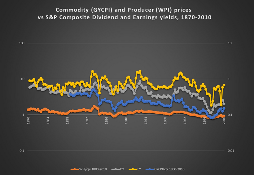
Again, the argument here is that up until the establishment of the Federal Reserve in 1914, these waves lasted about 50-60 years (Kondratiev and Schumpeter measured this from trough to trough) and then after the establishment of a "central bank monetary standard" (as opposed to a pure fiat standard), they lasted about 30 years (I am counting this peak to peak).
The following chart of the earnings yield on the S&P Composite, commodity inflation, and long-term Treasury yields draws some of this out a bit more.
Chart B. The earnings yield and real commodity prices have spiked every 30 years since World War I. (Warren & Pearson, Shiller, World Bank, St Louis Fed)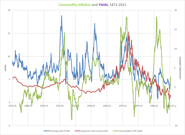
Roughly speaking, the yield/commodity/inflation supercycle peaked in 1920, 1950, 1980, and 2010. So '20, '50, '80, '10. You can use those as mental bookmarks when we start getting into the nitty gritty of the development and diffusion of disruptive innovations.
And, again, these spikes in prices and yields seem to coincide with major reconfigurations-typically violent reconfigurations-in global order. We will talk about war in the final installment, but this seems to be largely confirmed by Max Roser's chart of "global deaths in conflict."
Chart C. Global deaths may be a good proxy for global political instability. (Max Roser/Our World in Data)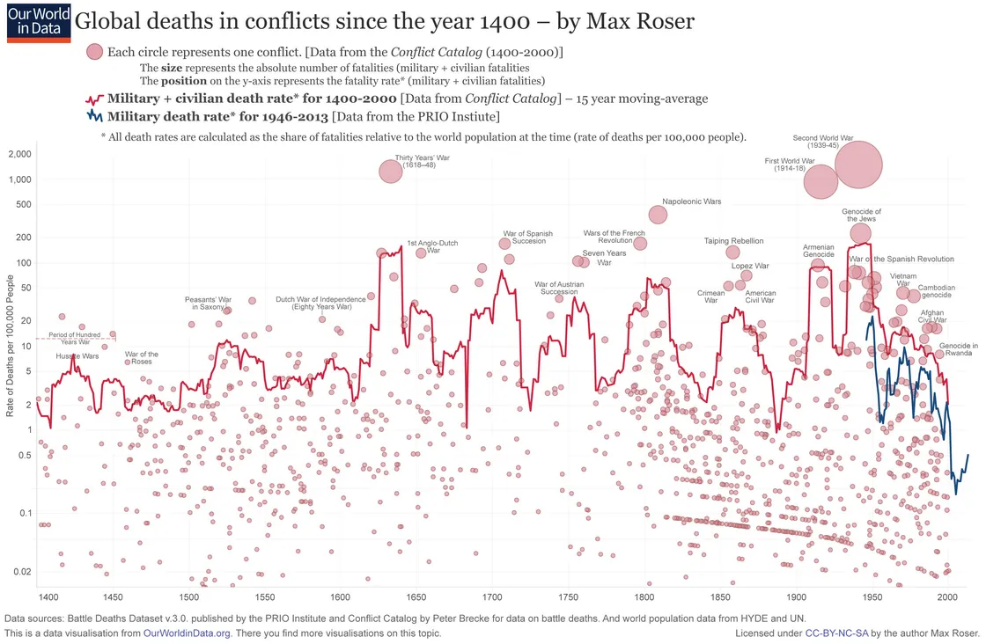
I have clumsily superimposed a chart of commodity prices to show the connection in the following image.
Chart D. Global deaths in conflicts have seemed to track commodity prices since 1800. (Max Roser; US Census, Historical Data, Chapter E; GYCPI, University of Michigan)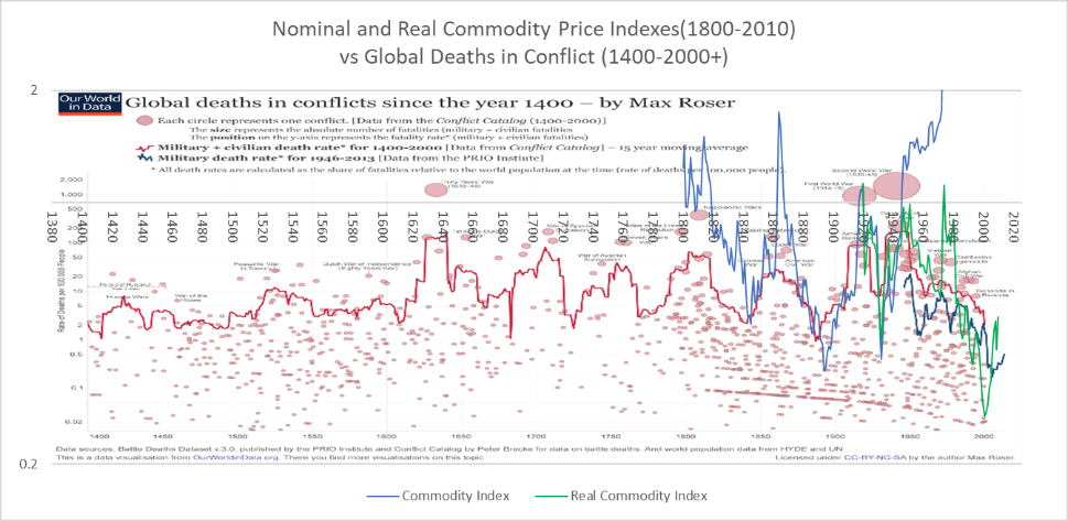
For Schumpeter, the quintessential innovation of the mid-19th Century and the epitome of this relationship between the emergence and diffusion of disruptive innovations and market behavior was the railroad, which we talked about in Part 1.
In the chart below, I have drawn a series of idealized Kondratiev Waves atop a chart illustrating the diffusion of the railroad. The blue line shows cumulative miles of railroad built. The orange line shows a 10-year compounded annual growth rate in cumulative miles built. And, the grey line shows the number of miles built over a decade's time; in other words, it shows the absolute change in the blue line.
Chart E. The transition from high growth to high diffusion occurs near peaks in the Kondratiev Wave. (St Louis Fed)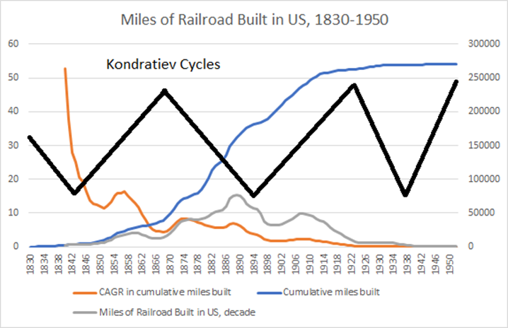
Disruptive innovations start popping up near the trough of these supercycles, and then they diffuse along an s-curve, as can be observed in the blue line in this chart. As discussed in Part 1, the growth rate is at its highest in the beginning, rapidly declines (albeit to a still very high level), and then descends at a logarithmically consistent rate, what I call a "decay rate." Thus, if the growth rate in one period is 50% and we identify a decay rate of 0.8, then the next period's growth rate will likely tend to be 40%, and the one after that 32%, and so on.
Incidentally, although I am still not sure if I should attempt to tackle the mathematics of the decay rate in this series or save it for a separate article, based on my recent dabbling, it appears to me that the diffusion of innovations follows an s-curve but not a logistic curve, and this is suggested by the behavior of the decay rates in innovation history in contrast to decay rates in the mathematics of a logistic curve. This would appear to be significant for trying to project future growth rates, future adoption levels of innovations, and terminal cash flows in DCF models. But, as interesting as that might be, it will distract us from our current task of understanding the timing of the diffusion of innovations and the possible interactions those diffusions have with markets and societies.
If my thesis is correct, we should expect to find disruptive innovations emerging at the trough of Kondratiev Waves ("secular" lows in real commodity prices and "secular" highs in the stock market PE ratios). They will experience explosive but falling growth during the rise in commodity prices and equity yields (and a rise in global political instability), and once the Kondratiev Wave peaks (thus peaks in commodities, lows in PEs, and peaks in global political instability), those disruptive innovations will enter the period of mass adoption, as evidenced by the frequency curve. Typically, mass adoption (let's say something like a 50% adoption rate) will be achieved during the fall in the Kondratiev Wave, as we saw with railroads.
Innovation supercycles since 1914
Perhaps the biggest problem is to determine what qualifies as a disruptive innovation. My solution to this problem is to use the data and observations from somebody who is not interested in Schumpeter or Kondratiev Waves or the cyclical nature of innovation. In The Rise and Fall of American Growth: The US Standard of Living Since the Civil War, Robert Gordon is interested in tracking those changes that best reflect and most greatly impacted American economic life over the long run, but he is not looking for cycles. He is therefore more likely to be objective in identifying disruptive innovations.
Below, I am going to review virtually all of the diffusion charts of innovations made over the last century that Gordon presents in his book. Along the way, we need to keep in mind those benchmark years mentioned earlier (1920, 1950, 1980, 2010). We should see a burst of disruptive innovations in the decade prior to those years, respectively, and mass adoption in the decades immediately after.
If it helps, I am putting this schematic here as a reference. If things go according to plan, a PDF should be attached to the bottom that readers can open and consult while reading through the litany of the last century's innovations.
| Technology, Political Order, and Markets since 1914 | |||||||
| Approximate Period | Wave | Commodities | Equity yields | Inflation | Global political stability | Number of new disruptive innovations | Adoption of new disruptive innovations |
| 1895-1920 | Upswing | Rising | Rising | Rising | Falling | High | Low |
| 1920-1940 | Downswing | Falling | Falling | Falling | Rising | Low | High |
| 1940-1950 | Upswing | Rising | Rising | Rising | Falling | High | Low |
| 1950-1970 | Downswing | Falling | Falling | Falling | Rising | Low | High |
| 1970-1980 | Upswing | Rising | Rising | Rising | Falling | High | Low |
| 1980-2000 | Downswing | Falling | Falling | Falling | Rising | Low | High |
| 2000-2010 | Upswing | Rising | Rising | Rising | Falling | High | Low |
| 2010-2030? | Downswing | Falling | Falling | Falling | Rising | Low | High |
Let's begin with what seems to be the weakest evidence.
This chart shows diffusions of "modern conveniences".
Chart F. The diffusion of modern conveniences seems somewhat less prone to innovation cycles. (Robert Gordon's The Rise and Fall of American Growth)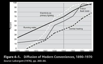
These tended to show relatively steady diffusion rates. The one that shows the greatest cyclicality, I think, is indoor flush toilets, which jumped between 1920 and 1930 (from 20% to 51% for the whole US) and then again between 1950 and 1960 (from 28% to 62% of US farms, concentrated especially in nonwhite farms). This is echoed in the central heating numbers (1% to 42% between 1920 and 1940, according to the original source (Lebergott's The American Economy, p. 278)).
Gordon puts a vertical line at 1940, because for him, this marks a great divide in post-Civil War history between a period of structurally high growth and innovation and a period of lower growth. Interestingly, he marks the transition in 1940, not 1930, at the brink of the Great Depression. This is a point we will return to in the final installment when we reconsider the connection between technological progress and asset prices.
For now, let's continue to the next chart.
Chart G. The automobile and the radio were the quintessential innovations of the 1910-1940 period. (Robert Gordon, The Rise and Fall of American Growth)
This chart shows four innovations, two of which became ubiquitous in the 1920-1940 period, and another of which achieved the minimum threshold in the early 1940s, according to this chart.
Radios, washing machines, and refrigerators all see sudden jumps during the 1920s and through the 1930s. Unfortunately, if you go back to Lebergott's book, there is a gap in the data between 1930 and 1970 for washing machine diffusion; the 1941 figure of 35%-44% that Gordon seems to use here is for rural inhabitants. Presumably, it was higher in urban and suburban America, and therefore it is possible that Gordon's chart underestimates the degree of diffusion of washing machines in the 1920-1940 period.
It is possible that mechanical refrigeration was ultimately a differentiation within the relatively new and general category of refrigeration. I plot the refrigeration numbers from Lebergott below, including the growth rate and the frequency curve.
Chart H. Refrigeration conforms unevenly to the pattern described. (Stanley Lebergott)
Generally, we will find that the patterns in the chart of mechanical refrigeration (below) are typical. Growth rates in diffusion will be extremely high during the Kondratiev peak and the frequency curve will peak during the Kondratiev downswing. In the case of refrigeration generally, there appear to have been two peaks.
Chart I. The diffusion of mechanical refrigerators conforms to the Kondratiev/Schumpeter pattern quite nicely. (Lebergott)
In The Diffusion of Innovations, Everett Rogers defined the "frequency curve" as absolute changes in the "cumulative curve," i.e., the rate of diffusion (see the following chart).
Chart I. Everett Rogers's formulation of the diffusion of innovations over time is the classic description. (Everett Rogers, The Diffusion of Innovations)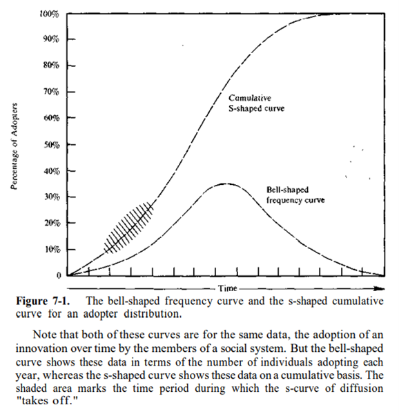
Again, typically we will find the highest growth rates in adoption (the cumulative curve in Roger's parlance) during the upswing/peak of Kondratiev waves and a peak in the frequency curve during the downswing. And, ubiquity (a diffusion rate in excess of 50%) typically also occurs during that downswing.
The chart below shows the diffusion of railroads, which we have already looked at, and highways.
Chart J. Paved highway expansion appears to have been highest in 1920-1940, 1950-1970, and 1980-2000. (Robert Gordon)
Theoretically, there is no limit on the size of networks, so it is hard to speak of a diffusion rate on a scale of 0%-100%, but the principles are broadly the same. The growth rate is highest during the rising Kondratiev and the frequency curve is highest during the downswing. Thus, from 1900-1950, just from eyeballing the chart, we can assume that the frequency curve for highway diffusion was highest in the 1930s.
Why should we care about the frequency curve?
Imagine that the diffusion rate of cars in the US was 0.1% in 1900 (for the purposes of this thought experiment, the precise numbers do not matter), 3% in 1910, 30% in 1920, and 60% in 1930. The growth rates per decade would be 30x, 10x, and 2x, but the absolute change in the rate of diffusion would be +2.9 basis points, +27 basis points, +30 basis points. It is the latter change, the frequency curve, that would presumably have the biggest impact on society. The actual values are in the following two charts based on data from the Department of Energy.
Chart K. Diffusion growth drops just as diffusion rates leap. (Department of Energy)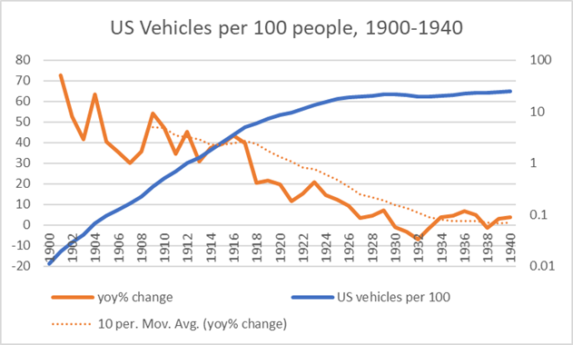
Growth rates, by almost any measure, were in a continuous state of decline from the very beginning. The following chart compares the year-on-year growth rate with the frequency curve.
Chart L. Diffusion growth drops just as diffusion rates leap, as evidenced by the frequency curve. (Department of Energy)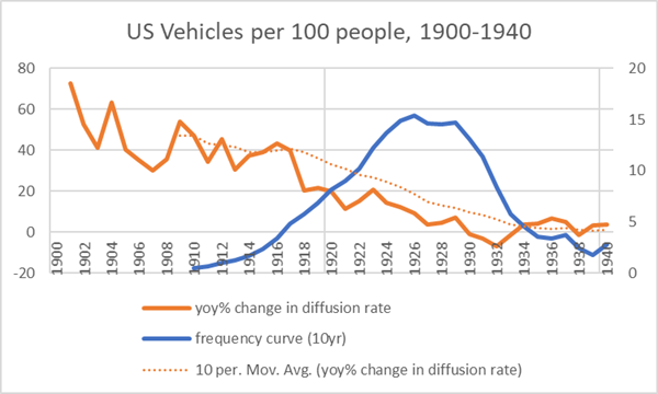
It appears, moreover, that there is a sudden and permanent drop in the growth rate near the peak of the Kondratiev Wave. As we will see, this seems to be the case for nearly all of the most impactful innovations that we will cover here.
The following chart plots the rate of change in the diffusion rate (in orange), but this time beside a three-year annualized growth rate in the frequency curve (in blue). For example, if there were 0.019 vehicles per 100 people (or households) in 1901 and there had been 0.011 per 100 people the year before (in 1900), that is a change of +0.008. I treat that as a very rough proxy for sales that year. If there were 0.029 vehicles per 100 people in 1902, that is an absolute change in the diffusion rate of +0.010. Calculating those changes year for year, I then calculated three-year changes in those numbers (when the base year in the frequency curve value was negative, I presented the CAGR as 0%). Certainly, sales rates were higher than they appear in the latter half of this chart since a negative absolute change in the diffusion rate cannot be attributed to negative sales, but it is unlikely that they were dramatically higher.
Chart M. Growth rates in the frequency curve largely mirror growth rates in the diffusion/cumulative curve. (Department of Energy)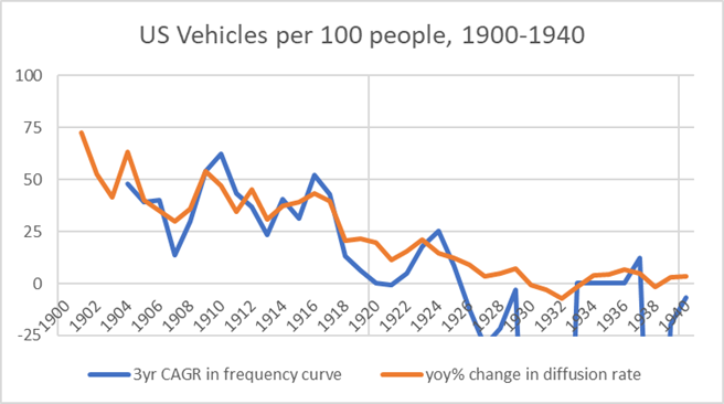
So, the rate of change in the frequency curve is meant to approximate a growth rate in sales. In this rate, too, we see a significant drop at the moment of transition from one Kondratiev regime to another.
In the chart below, I cross-checked this three-year CAGR in the frequency curve with historical data on personal consumption expenditures (PCE) for motor vehicles from Stanley Lebergott's Pursuing Happiness.
Chart N. PCE data largely confirms the patterns in the frequency curve. (Lebergott; Department of Energy)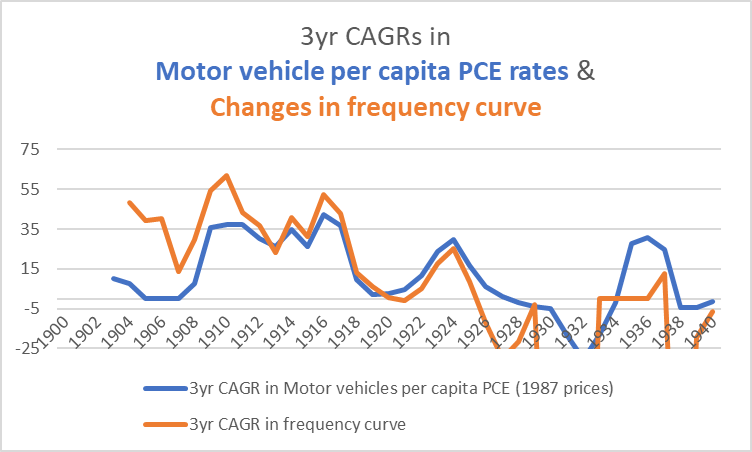
I am not clear on why the PCE data would remain below the rate calculated from changes in diffusion in the years prior to 1913. The PCE data suggests, for example, that there was virtually no change in per capita expenditures on motor vehicles in the 1901-1906 period, even though per capita ownership had risen 6x in that period.
Chart O. Data for the Model-T Runabout conform more to the diffusion data than to the PCE data. (Wikipedia)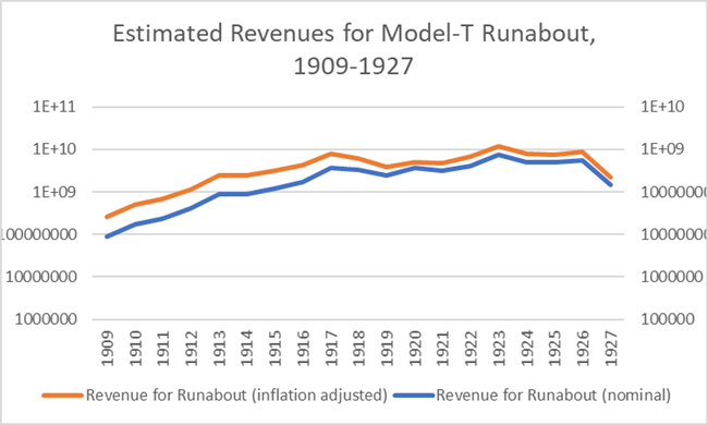
The data from slightly later about the Model T suggest that the decline in unit prices, even when adjusted for inflation, would not have been even remotely large enough to diminish overall revenues.
In any case, the PCE data confirms the patterns we have seen in the diffusion of the automobile in the first half of the 20th Century. Growth rates in unit sales are in a near-constant state of decline from the very beginning, unit prices are in a near-constant state of decline, and this is then followed by an even more dramatic drop in the rate of growth, which coincides with a persistent rise in the frequency curve, a transition in diffusion that coincides with the transition from an upswing in the Kondratiev wave (rising yields and prices) to a downswing (falling yields and prices).
Recall that the period from the late 1890s to the 1910s was one of rising prices and yields. Kondratiev said that a rising wave is one in which new inventions are "applied on a large scale," but it is not clear what that means. Do the explosive growth rates qualify as the application of new inventions "on a large scale" or is it the rise in the frequency curve?
I think the data laid out in Gordon's book and elsewhere helps clarify the relationship between the diffusion of technological goods and the Kondratiev Wave: a period of rising inflation, especially rising real commodity prices, and rising yields, especially equity yields, for whatever reason is also a period of high growth in new innovations, but the primary social impact of these new goods occurs during the decline in inflation, commodity prices, and yields. For automobiles, growth rates declined from 1900 to 1932. But the rate of diffusion leapt, as reflected in the frequency curve. You can think of this as being analogous to the dynamics in the numerators of a two-stage DCF model where the primary value in a given project typically comes from the low-growth terminal value rather than the high-growth first stage, even though the former is dependent on the latter.
Again, I believe we will find the patterns we noticed in automobiles (and railroads) in each of the major consumer durables mentioned earlier (radios, TVs, PCs, and smartphones), as well, but first let's return to Gordon's charts.
Remember, using automobiles as a template, we are looking for simultaneous transitions in growth rates and the absolute change in the diffusion rates to occur near the peak/transition of Kondratiev Waves, transitions that will largely coincide with the war cycles identified earlier. Log charts bring this out best. In the following chart, we can see that a major decline in the growth rate of vehicle-miles occurred in the 1920s, and airline revenues experienced two such declines in their growth rate, first in the late 1940s and again in the late 1970s.
Chart P. Growth rates in airline revenue passenger-miles declined in 1950-1970 as airline travel became commonplace. (Robert Gordon)
The following chart shows diffusion rates for radios, telephones, and televisions.
Chart Q. The diffusion of the television mirrored the diffusion of the radio in the previous Kondratiev Wave. (Robert Gordon)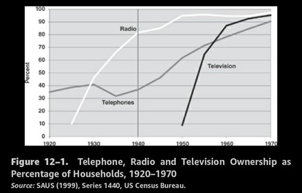
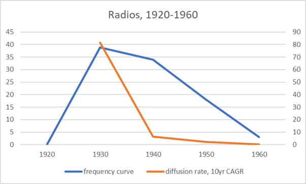
The highest rates of growth, almost as a matter of mathematical necessity, occurred before these lines begin at the ~10% level. They became ubiquitous, however, during the pairs of decades after the Kondratiev Cycle peaks near 1920 and 1950, respectively. The basic underlying technologies could be in place for decades, but it is sometime during the Kondratiev downswings that the products suddenly become ubiquitous. The following two charts are based on data from the US Census Bureau, with the household diffusion rate for 1920 estimated at 0.1%.
Chart R. Radio ownership absolutely exploded in the 1920s. (US Census Bureau (with author estimate for 1920)) Chart S. The frequency curve peaked in the 1920-1940 Kondratiev downswing. (US Census Bureau (with author estimate for 1920))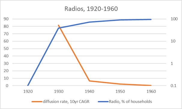
The following charts, based on data from TVhistory.tv, are the earliest I have been able to find radio data. Obviously, growth rates prior to the mid-1920s would have been much higher than the rates here.
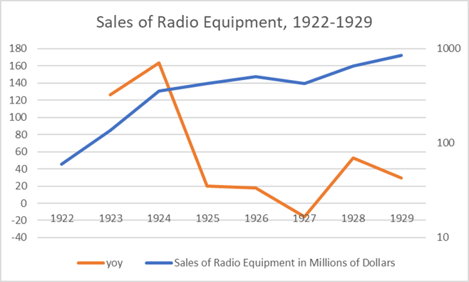
Chart T. Radio set production reflects the radio diffusion data. (TVhistory.tv) Chart U. Annual sales of radio equipment push the numbers even earlier and confirm the previous charts. (TVhistory.tv)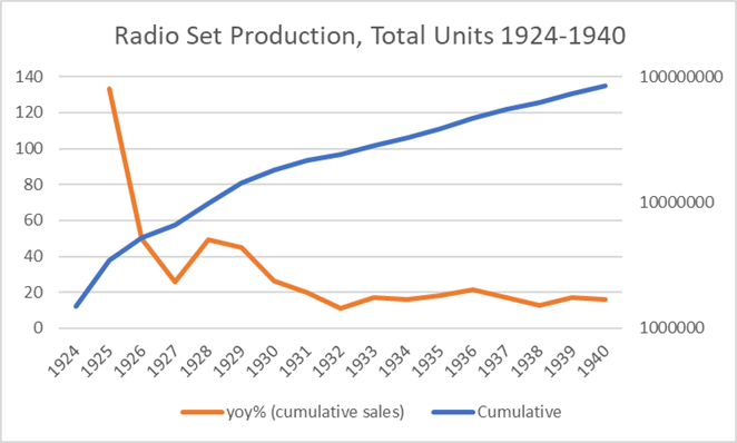
The number of radio stations leaves much the same impression. This chart is based on data from the Economic History Association's website.
Chart V. The number of radio stations underwent phenomenal growth in the early 1920s. (Economic History Association)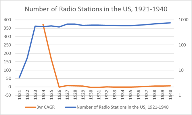
Radios got a later start than automobiles, probably due to suppression of civilian use of the technology during World War I but made up for it in the speed with which they became ubiquitous.
In the subsequent technology cycle, where TVs were the most iconic consumer technology, we see the typical pattern. The following chart is based on data from the U.S. Census Bureau.
Chart W. The frequency curve in TV diffusion peaked in the 1950s. (US Census Bureau)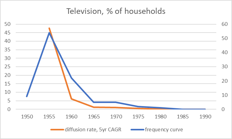
The following two charts are based on data from TVhistory.tv (see above for the links).
Chart X. The diffusion rate and timing resembles those for railroads, cars, and radios. (TVhistory.tv)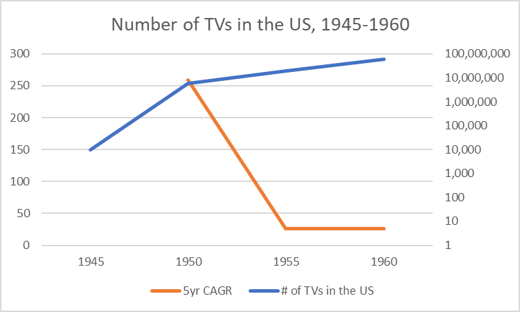
With the transition in the Kondratiev cycle, which would have peaked sometime around 1950, the growth rate appears to have suddenly dropped while the rate of diffusion skyrocketed even faster than it had with radios.
Chart Y. TV production data begins earlier and confirms the diffusion data. (TVhistory.tv)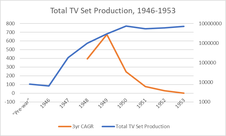
The phone, however, seems to have followed a path more reminiscent of "conveniences" mentioned earlier, at least until the advent of mobile telephony.
Chart Z. Cell phones became ubiquitous in the 1990s; smartphones in the 2010s (Robert Gordon)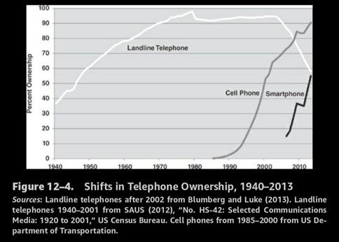
Handheld cell phones first emerged in the 1970s but did not become ubiquitous until the 1990s; smartphones first made their appearance in a rudimentary form as early as the 1990s but did not assume a genuinely recognizable form until the iPhone in the late 2000s. The following is a chart of smartphone sales based on data from Jeremy Reimer's website. Sales growth was elevated, if declining, throughout the 2000s, but dropped off significantly after 2007.
Chart AA. Rapid growth in the smartphone market was followed by rapid expansion.. (Jeremy Reimer data)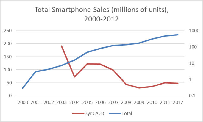
This is reflected in iPhone sales, as well. This chart is based on data from Statista.
Chart AB. iPhone sales growth rates dropped near the Kondratiev Wave peak in the late 2000s. (Statista)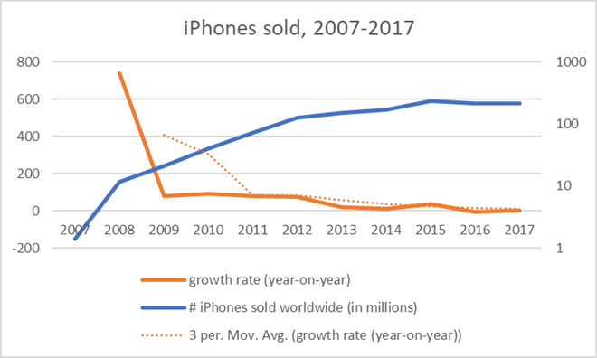
We looked at television before, but the following chart shows color TV, cable, and VCR diffusion rates.
Chart AC. Secondary innovations underwent mass diffusion during downswings in Kondratiev Waves. (Robert Gordon)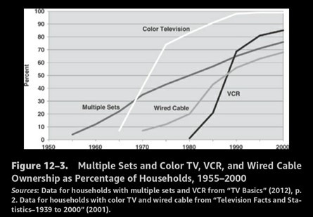
Cable and VCR diffusion rates clearly jumped in the 1980s and 1990s. Color TV went from below 10% of households in the mid-1960s to over 50% by the early 1970s as it presumably replaced black and white televisions.
Finally, there are personal computers.
Chart AD. Personal computer and internet adoption primarily occurred in the 1980-2000 period. (Robert Gordon)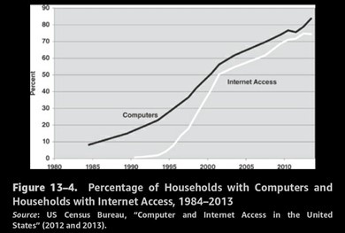
Fifty percent of US households had computers by the turn of the millennium. In the following chart, we see the typical growth patterns: high growth rates in sales during the upswing/peak of the Kondratiev Wave, followed by a simultaneous surge in the diffusion rate and decline in growth during the downswing.
Chart AE. Growth in personal computer sales exploded during the 1970s but were most widely adopted in the 1980s and 1990s. (Wikipedia) Chart AF. High growth in the 1970s followed by mass diffusion in the 1980s and 1990s. (Wikipedia)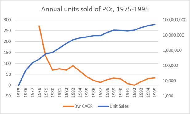
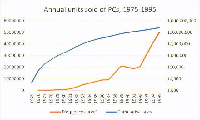
Going back to the Census data that Gordon uses, we can calculate the frequency curve, as illustrated in the following chart. The data from the US Census is somewhat sporadic, so some of the values have to be interpolated, but the trend is so clear that it is nearly impossible for the interpolations to be so far off as to make any difference to the point being made: mass adoption occurred during the 1980-2000 Kondratiev Wave downswing.
Chart AG. Diffusion rates are confirmed by sales data. (US Census Bureau)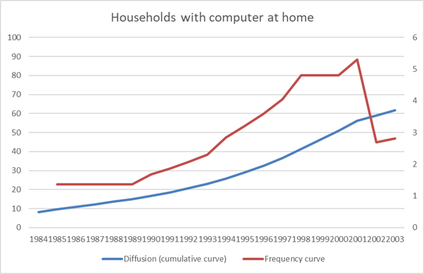
We can also approximate the rate of change in the rate of diffusion.
Chart AH. Growth rates declined as diffusion expanded, then dramatically declined in early 2000s. (US Census Bureau)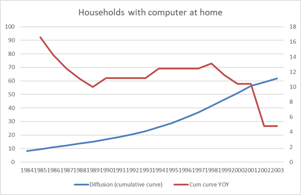
Due to the interpolations, it is better to use a smoothed rate of change to illustrate the change in the frequency curve.
Chart AI. The frequency curve peaked in the late 1990s. (US Census Bureau)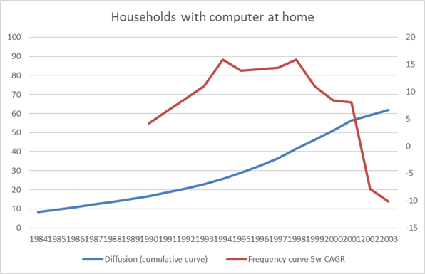
In virtually all of the diffusion rates of innovations that Gordon charts from the last century, the given innovation emerges during the Kondratiev upswing years (roughly, 1895-1920, 1940-1950, 1970-1980, 2000-2010) and then goes through mass adoption in the subsequent two decades (1920-1940, 1950-1970, 1980-2000, 2010-????). Explosive growth during the upswing, mass adoption during the downswing, just as we saw with railroads.
This seems to be truer for the diffusion of durable consumer goods than for more utility-like "conveniences" such as electrification, running water, telephones, or central heating. It is not clear (to me, at least) whether this is because they are more utility-like or whether it is because they were legacy technologies. Two basic consumer innovations that are not charted in Gordon's books are early image-recording devices (cameras) or sound-producing goods (phonographs). Both of these goods emerged in the 19 th Century.
What do the exceptions signify?
The commercialization of photography began, it seems, after the Civil War, even though the basic technology was well established by the 1830s. Thus, cameras may have tracked the path of the railroad (invention and expansion in the 1830s-1860s and then commercialization afterwards) but without achieving anything like the ubiquity we see in post-1914 consumer goods. In 1898, it was estimated that 1.5 million roll cameras had been sold to the public, which would have been about 2% of the population. Two years later, the one-dollar Brownie camera was introduced, selling over 100,000 units in the first year. Let's say 5 million cameras were sold over the next 20 years, that would take us to maybe 7 million cameras. Even assuming that each of these purchases were made by new adopters, we would struggle to get to 10% of the population by 1920. Mass adoption of cameras likely occurred sometime after the 1920s.
Movie attendance was, apparently, way ahead of camera ownership, entering a state of mass diffusion during the 1920s.
Chart AJ. Movie attendance appears to have followed a similar curve to the diffusion of consumer durables in the 1920s. (Robert Gordon)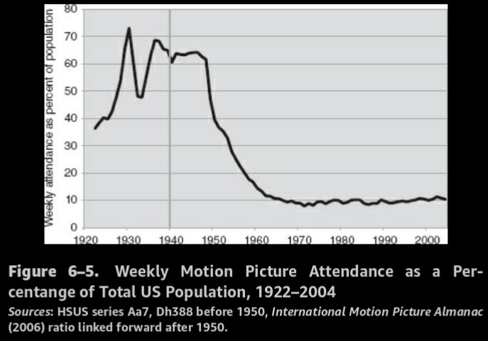
Gordon does not record rates of camera diffusion, and I have not been able to locate them for the first half of the 20th Century.
My suspicion is that cameras did not have the impact on society that later, similar consumer goods (radios, TV, computers, smartphones) did, partly because they did not experience the diffusion patterns that the latter group did, insofar as camera ownership appears to have been confined to the upper middle class until quite late.
With the establishment of a new economic regime, presumably due to the establishment of a central banking monetary system, consumer durable goods played a role in the 20th Century that they did not in the 19th Century. Thus, even though the emergence of photographic and phonographic technology occurred in the 19th Century and was commercially available before the turn of the century, and even though this was a more significant leap, technologically, than the innovations that followed, they played an inferior role to the more socialized forms of the technologies (especially in penny arcades, nickelodeons, and eventually movie theaters) up until the establishment of the Fed. Just as the car killed off public transportation, TV wrecked the movie theater.
There are two points here. One, over the last century, Kondratiev/Schumpeter Waves have tended to be more tied to supercycles in consumer durables than to "conveniences" or industrial processes. Two, assuming that the transformation in the role of consumer durables is linked to the change in the behavior of the Kondratiev/Schumpeter Waves they are linked to, this is probably due to the establishment of the Fed, which simultaneously transformed the way stock prices, for example, related to commodity prices and earnings.
This is a thread that we will pick up later, but the important thing for this installment is the connection between Schumpeter Waves and Kondratiev Waves.
Conclusion
My argument is that these transformative innovations emerge primarily during the trough of supercycles in commodity prices and the earnings yield (and political instability), see explosive growth as prices, yields, and instability rise, and then enter a period of declining growth and mass adoption after commodity prices, yields, and instability peak.
The automobile and the radio, the TV, the PC, and the smartphone, which seem to me the most disruptive of these innovations, all followed this path. It is important, I think, to note that these innovations are treated by Schumpeter as rather distinct from "technology" and "inventions." Innovations are effectively market-ready modifications of inventions. If automobiles were invented in the late 19th Century, they were not really ready for mass diffusion until Henry Ford had made multiple adjustments that would balance manufacturing, quality, and demand. The invention is the first combination of technologies (what is often called "general purpose technologies") that shows that something is possible. Whether it is capable of mass adoption is up to the innovators.
The camera does not seem to have had the kind of social impact in the 19th Century that radio, TV, or smartphones had in the last century, at least in part because they did not penetrate the market (or more to the point, society) until, it seems, sometime after World War I. My assumption, I think in line with Gordon, is that moving from a world without cameras to a world with cameras is a more significant leap than moving from a world with cameras to a world with motion pictures or TV. But, the social and psychological impact depends largely on the mass diffusion of a technology.
That suggests that it is the diffusion of innovations and not the underlying technologies themselves that leave their mark on history and its cycles.
In keeping with the plan stated at the beginning of the article, I have tried to show the correlations between the earnings yield, commodity prices, war, and waves of disruptive innovations in these first three parts. In Part 4, we will turn to what all this might imply for equity prices and particularly tech stocks.


Gloss