
One of Android's strengths has always been notifications, especially with Android Oreo's addition of notification channels. Each app can have different categories of alerts, with different levels of priority. Android Q Beta 4 is making this functionality a bit easier to understand, with the addition of colorful icons and guides.
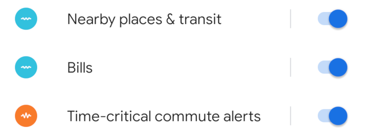
The notification channels page in the app settings has received a few changes in Android Q Beta 4. The checkboxes and settings gears have been replaced with colorful icons and simple switches. The icons represent the priority level — the blue waves mean low priority, and the orange icon means high priority.


Left: Android Q Beta 3; Right: Android Q Beta 4
It's easier than ever to see which channels will buzz your phone and which will silently appear at the bottom of your notification stack. For people who aren't familiar with notification channels or what the icons mean, Android will display small tips on the same screen.


It's always nice to see power user features being reorganized in a way that more people can understand. The high level of customization that Android allows is one of the platform's best strengths, but when all the options overwhelm people, it can also be a major weakness.


Gloss