
The ggplot2 package is powerful and almost endlessly customizable, but sometimes small tweaks can be a challenge. The ggtext package aims to simplify styling text on your visualizations. In this tutorial, I’ll walk through one text-styling task I saw demo’d at RStudio Conference last month: adding color.
If you’d like to follow along, I suggest installing the development version of ggplot2 from GitHub. In general, some things shown at the conference weren’t on CRAN yet. And ggtext definitely does not work with some older versions of ggplot.
You have to install ggtext from GitHub, since at the time I wrote this, the package wasn’t yet on CRAN. I use remotes::install_github() to install R packages from GitHub, although several other options, such as devtools::install_github(), work as well. Note that in the code below I include the argument build_vignettes = TRUE so I have local versions of package vignettes. After that, I load ggplot2, ggtext, and dplyr.
remotes::install_github("tidyverse/ggplot2", build_vignettes = TRUE)
remotes::install_github("wilkelab/ggtext", build_vignettes = TRUE)
library(ggplot2)
library(ggtext)
library(dplyr)
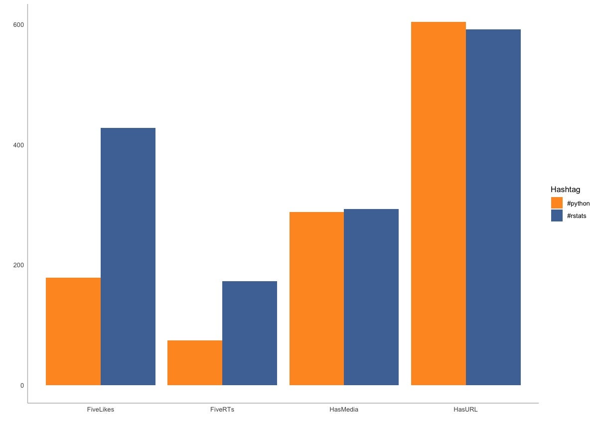
For demo data, I’ll use data comparing tweets about R (with the #rstats hashtag) with tweets about Python (#python). After downloading recent tweets, I did some filtering, took a random sample of 1,000 of each, and then calculated how many in each group had at least five likes, had at least five retweets, included a URL, and included media like a photo or video.
You can re-create the data set with the code block below. Or you could use any data set that makes sense as a grouped bar chart and modify my subsequent graph code accordingly.
Hashtag < - c("#python", "#python", "#python", "#python", "#rstats", "#rstats", "#rstats", "#rstats")
Category < - c("FiveLikes", "FiveRTs", "HasURL", "HasMedia", "FiveLikes", "FiveRTs", "HasURL", "HasMedia")
NumTweets < - c(179, 74, 604, 288, 428, 173, 592, 293)
graph_data < - data.frame(Hashtag, Category, NumTweets, stringsAsFactors = FALSE)
The graph_data data frame is in a “long” format: one column for the hashtag (#rstats or #python), one for the category I’m measuring, and one column for the values.
str(graph_data)
'data.frame':	8 obs. of  3 variables:
 $ Hashtag  : chr  "#python" "#python" "#python" "#python" ...
 $ Category : chr  "FiveLikes" "FiveRTs" "HasURL" "HasMedia" ...
 $ NumTweets: num  179 74 604 288 428 173 592 293
That is typically the structure you want for most ggplot graphs.
Next I’ll create a grouped bar chart and save it to the variable my_chart.
my_chart < - ggplot(graph_data, aes(x=Category, y=NumTweets, fill= Hashtag)) +
  geom_col(position="dodge", alpha = 0.9) +
  theme_minimal() +
  xlab("") +
  ylab("") +
  theme(panel.grid.major = element_blank(), panel.grid.minor = element_blank(), panel.background = element_blank(), axis.line = element_line(colour = "grey")) +
  scale_fill_manual(values = c("#ff8c00", "#346299"))
The alpha = 0.9 on line two just makes the bars a little transparent (alpha = 1.0 is fully opaque). The last few lines customize the look of the graph: using the minimal theme, getting rid of x and y axis labels, removing default grid lines, and setting colors for the bars. The graph should look like this if you run the code and then display my_chart:
 Sharon Machlis, IDG
Stacked bar chart created with ggplot2.
Next I’ll add a title with this code:
my_chart +
  labs(title = "#python and #rstats: Comparing 1,000 random tweets")
 Sharon Machlis, IDG
Grouped bar chart with headline.
It looks . . . OK. But at a separate RStudio Conference session, The Glamour of Graphics, Will Chase told us that legends are less than ideal (although he made that point in slightly more colorful language). He showed that adding colors right in the graph headline can improve your graphics. We can do that fairly easily with the ggtext package.
Knowing a little HTML styling with in-line CSS will definitely help you customize your text. In the code below, I’m using span tags to section off the parts of the text I want to affect — #python and #rstats. Within each set of span tags I set a style — specifically text color with color: and then the hex value of the color I want. You can also use available color names in addition to hex values.
my_chart +
  labs(
    title = "#python and
    #rstats: Comparing 1,000 random tweets"
  ) +
  theme(
    plot.title = element_markdown()
  )
Note that there are two parts to styling text with ggtext. In addition to adding my styling to the headline or other text, I need to add element_markdown() to whatever plot element has the colors. I did that in the above code inside a theme() function with plot.title = element_markdown().
If you run all of the code until now, the graph should look like this:
 Sharon Machlis, IDG
ggplot2 graph with color in the headline text.
I find it a little hard to see the colors in this headline text, though. Let’s add tags to make the text bold, and let’s also add legend.position = none to remove the legend:
my_chart +
  labs(
    title = "#python and
    #rstats: Comparing 1,000 random tweets"
  ) +
  theme(
   plot.title = element_markdown(), legend.position = "none"
  )
 Sharon Machlis, IDG
Graph with bold and colored headline text, plus legend removed.
If I want to change the color of the x-axis text, I need to add data with that information to the data frame I’m visualizing. In the next code block, I create a column that adds bold italic red to the FiveLikes and FiveRTs category labels and styles the rest as bold italic without adding red. I also increased the size of the font just for FiveLikes and FiveRTs. (I wouldn’t do that on a real graph; I do it here only to make it easier to see the differences between the two.)
graph_data < - graph_data %>%
  mutate(
    category_with_color = ifelse(Category %in% c("FiveLikes", "FiveRTs"),
    glue::glue("{Category}"),
    glue::glue("{Category}"))
  )
Next I need to re-create the chart to use the updated data frame. The new chart code is mostly the same as before but with two changes: My x axis is now the new category_with_color column. And, I added element_markdown() to axis.text.x inside the theme() function:
ggplot(graph_data, aes(x=category_with_color, y=NumTweets, fill= Hashtag)) +
  geom_col(position="dodge", alpha = 0.9) +
  theme_minimal() +
  xlab("") +
  ylab("") +
  theme(panel.grid.major = element_blank(), panel.grid.minor = element_blank(), panel.background = element_blank(), axis.line = element_line(colour = "grey")) +
  scale_fill_manual(values = c("#ff8c00", "#346299")) +
  labs(
    title = "#python and #rstats: Comparing 1,000 random tweets"
  ) +
  theme(
    plot.title = element_markdown(), legend.position = "none",
    axis.text.x = element_markdown() # Added element_markdown() to axis.text.x in theme
  )
The graph now looks like this, with the first two items on the x axis in red:
 Sharon Machlis, IDG
Graph with stylized x-axis text.
There is more you can do with ggtext, such as creating stylized text boxes and adding images to axes. But package author Claus Wilke warned us at the conference not to go too crazy. The ggtext package doesn’t support all of the formatting commands that are available for R Markdown documents. You can check out the latest at the ggtext website.
For more R tips, head to the Do More With R page at https://bit.ly/domorewithR or the Do More With R playlist on the IDG TECHtalk YouTube channel.
This story, "Add color to your ggplot2 text in R" was originally published by


Gloss